A LOUD CATEGORY DOESN'T NEED MORE NOISE. IT NEEDS SOMETHING PEOPLE REMEMBER.
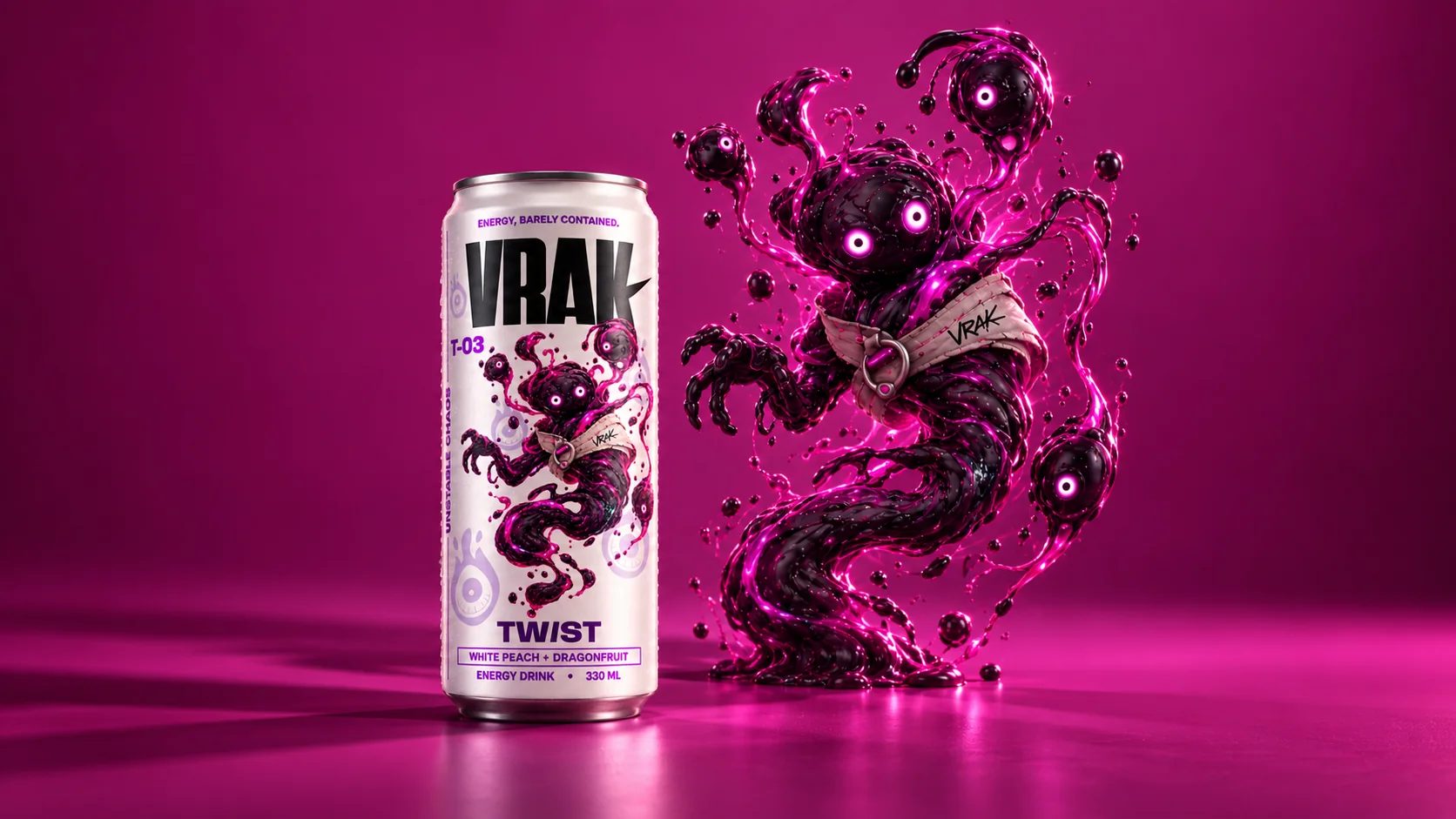
BRAND SYSTEM
I used Anybody for the loud, compressed brand voice and Onest for functional information. The contrast gave me a flexible hierarchy: expressive enough for campaigns, but controlled enough to keep packaging, flavor names and product details clear.
I BUILT VRAK AS A SYSTEM, NOT A SET OF SEPARATE CANS.
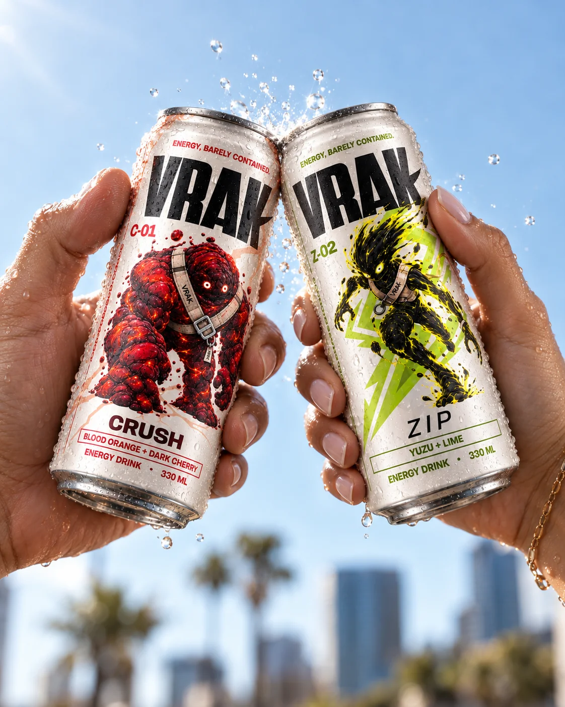
The same typography, structure and brand codes hold the range together, while each flavor gets its own color, character and visual behavior. This balance gives the lineup strong shelf recognition without making the three products feel interchangeable.
DISPLAY
ANYBODY
UTILITY
ONEST
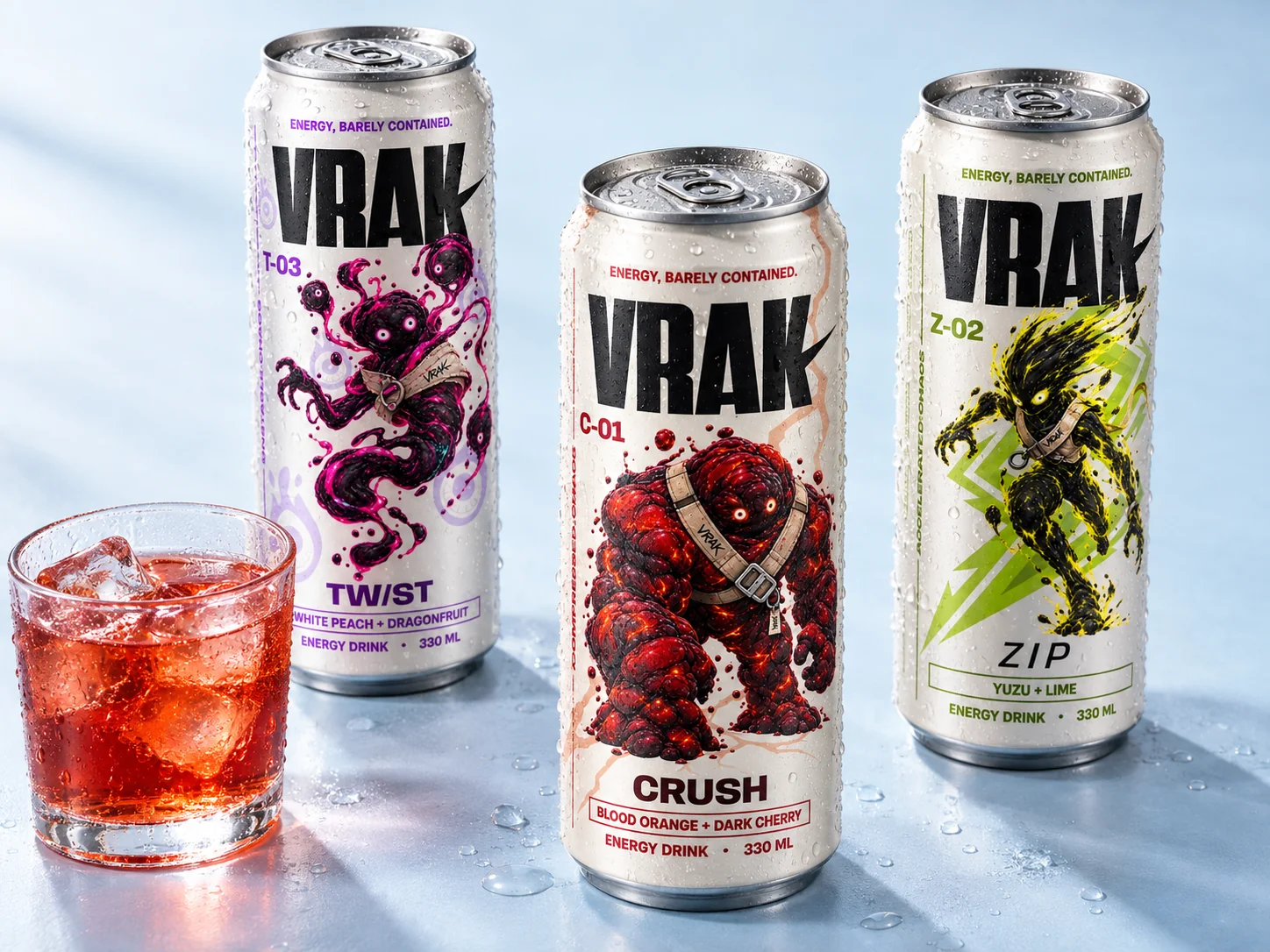
CHARACTERS
I WANTED EACH FLAVOR TO BE RECOGNIZABLE BEFORE YOU EVEN READ ITS NAME.
So I turned the three SKUs into distinct characters, each built around a different type of energy: pressure, acceleration and mutation. This gave me a visual system that could work on packaging, social content and advertising while keeping every flavor tied to the same brand idea.
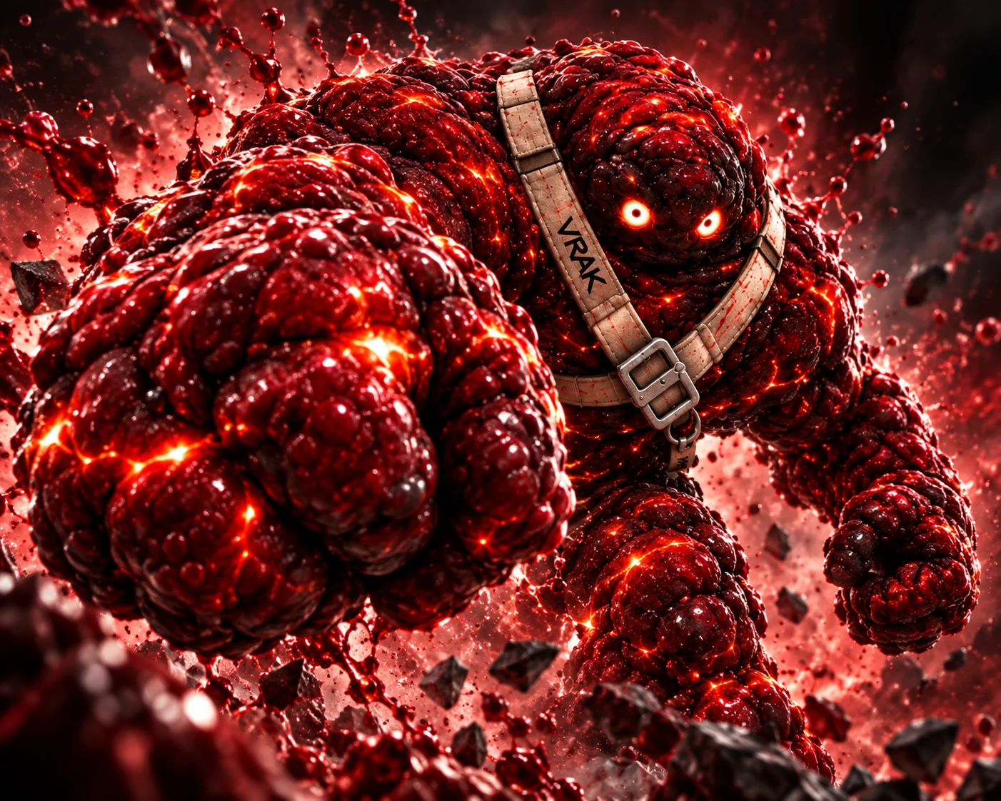
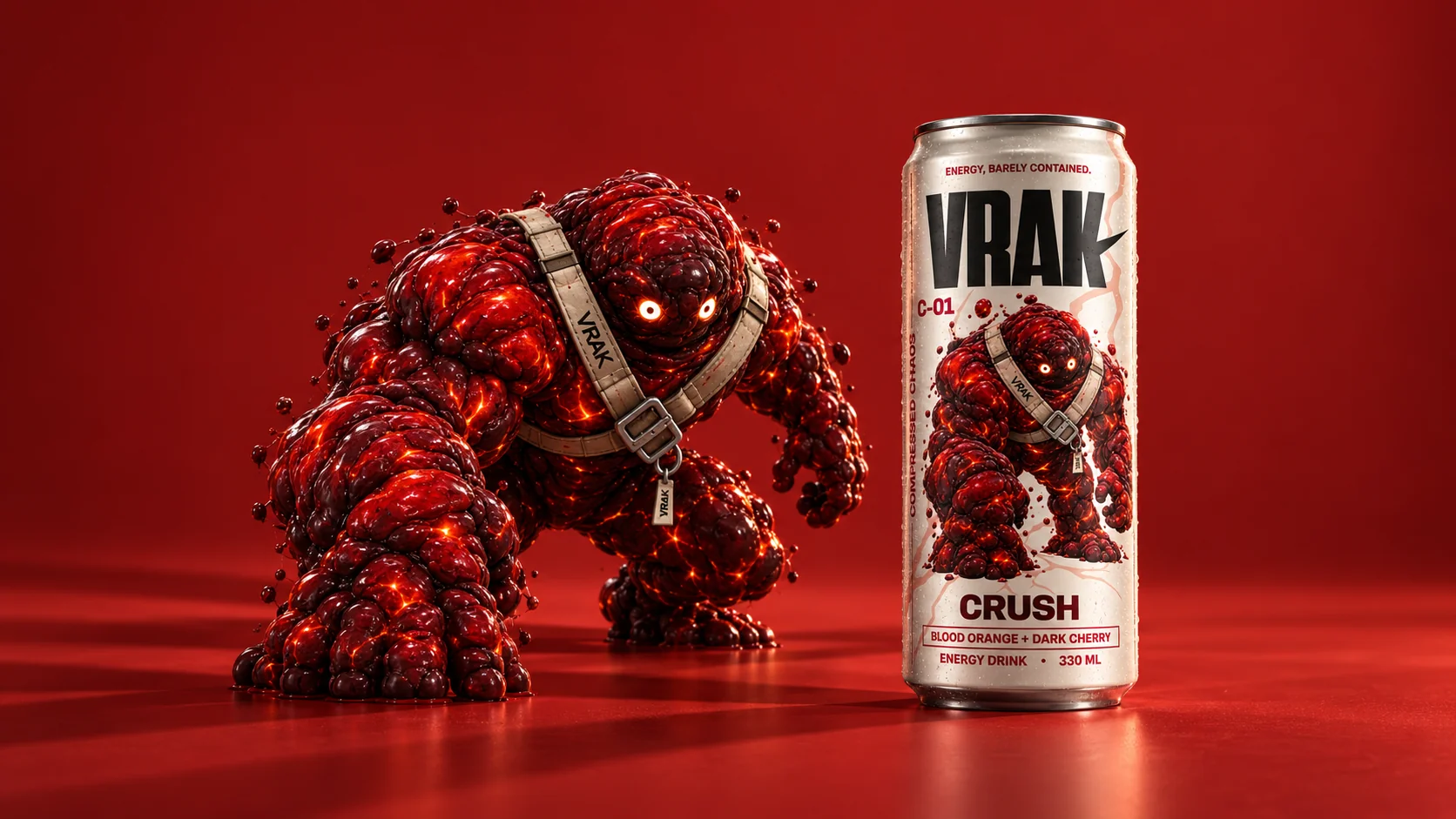
CRUSH
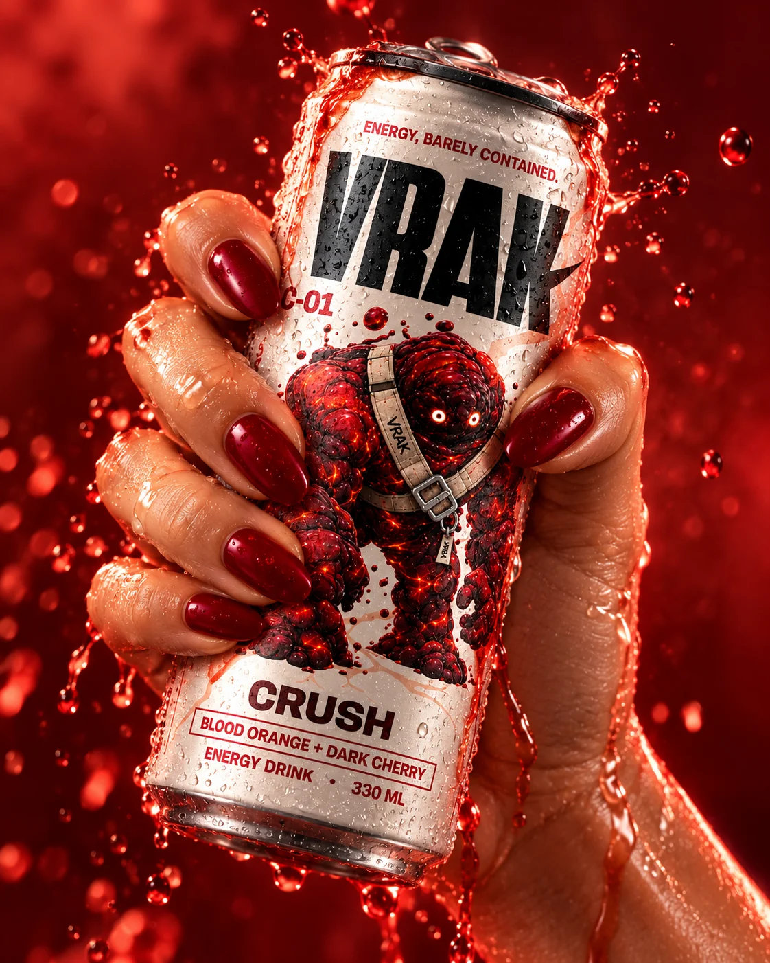
I designed CRUSH around pressure and impact. The dense red mass, forward movement and heavier composition make the flavor feel physical and aggressive before the viewer reads a single word.
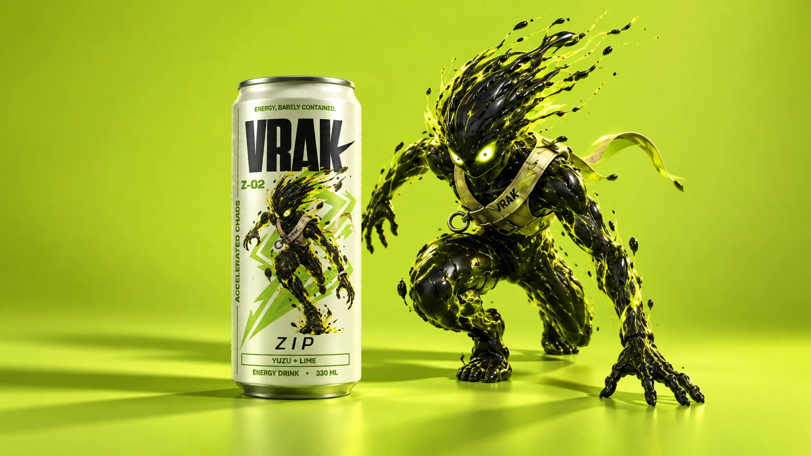
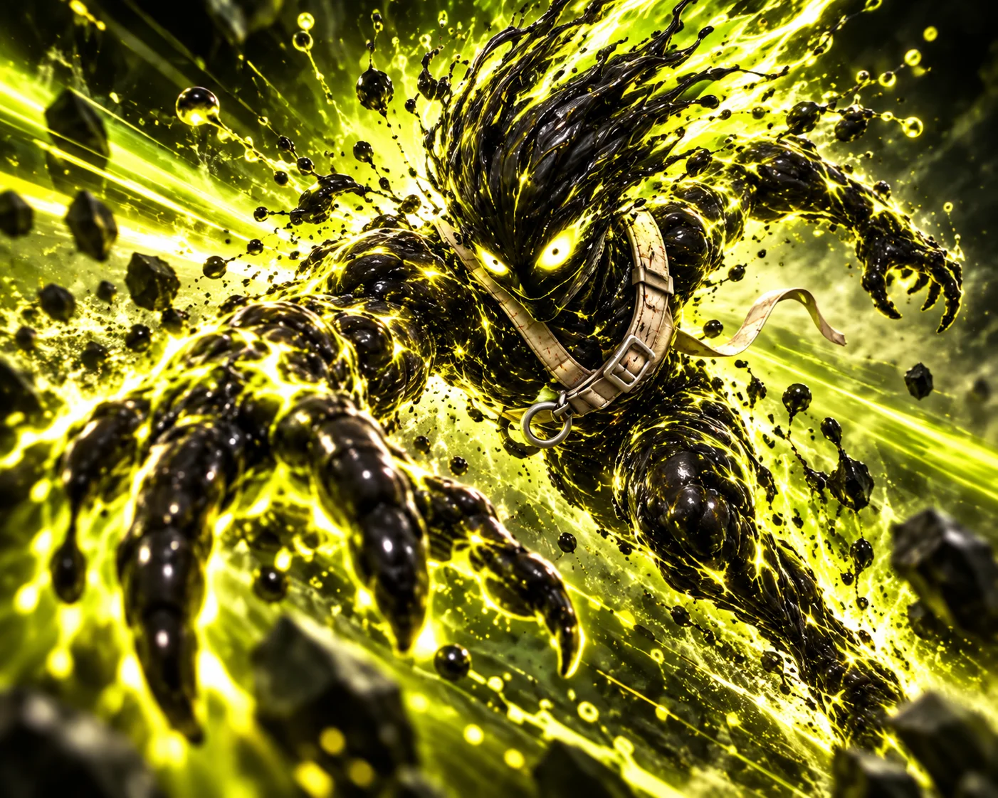
ZIP
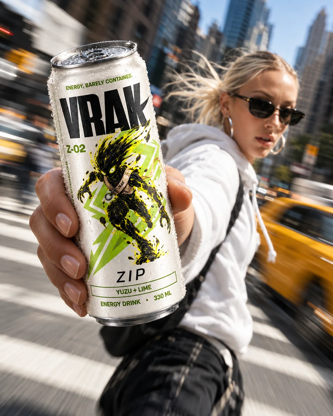
With ZIP, I shifted the system toward speed. The diagonal motion, sharper silhouette and acid-lime palette create a lighter, faster energy while keeping the character clearly inside the same VRAK world.
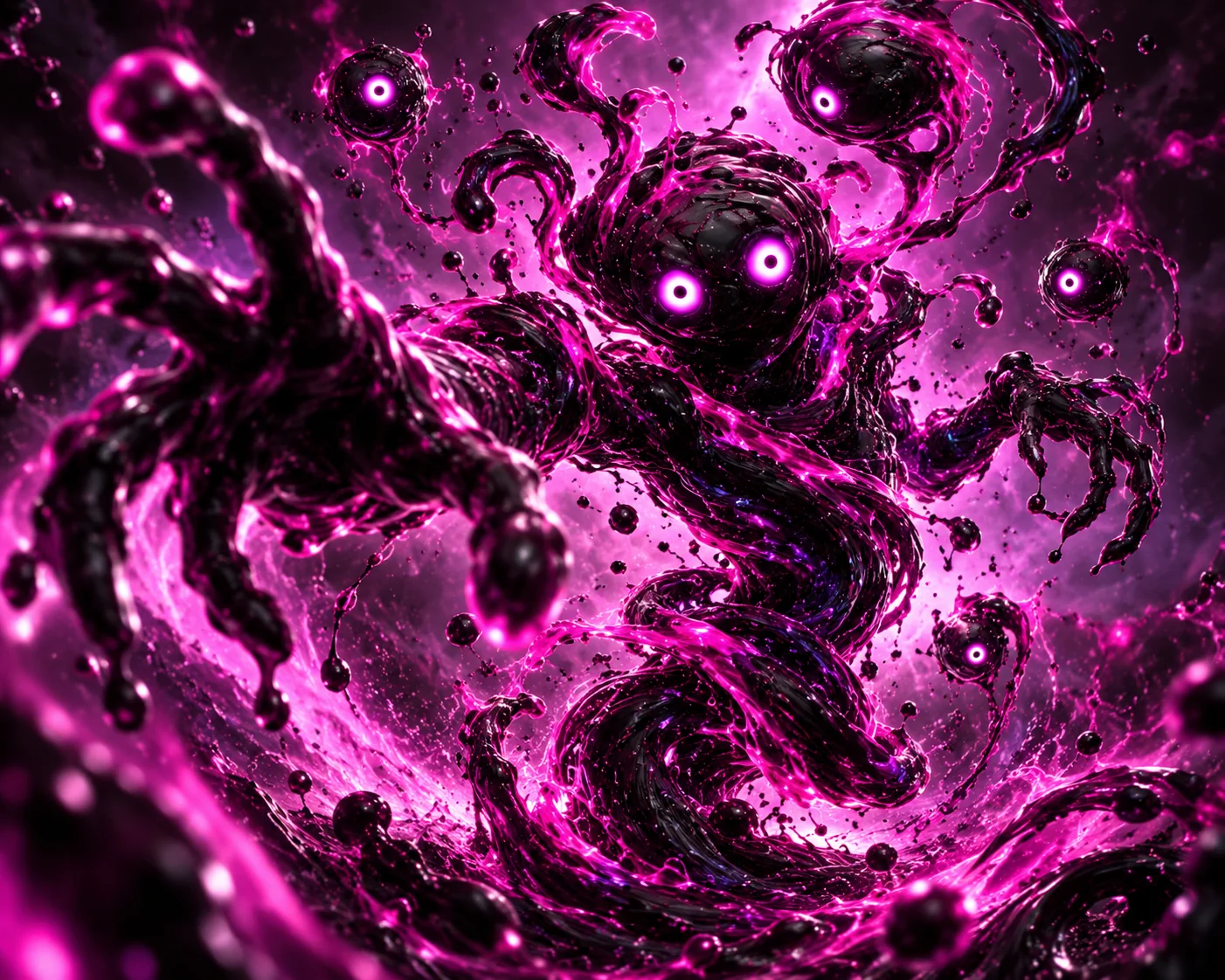
TWIST
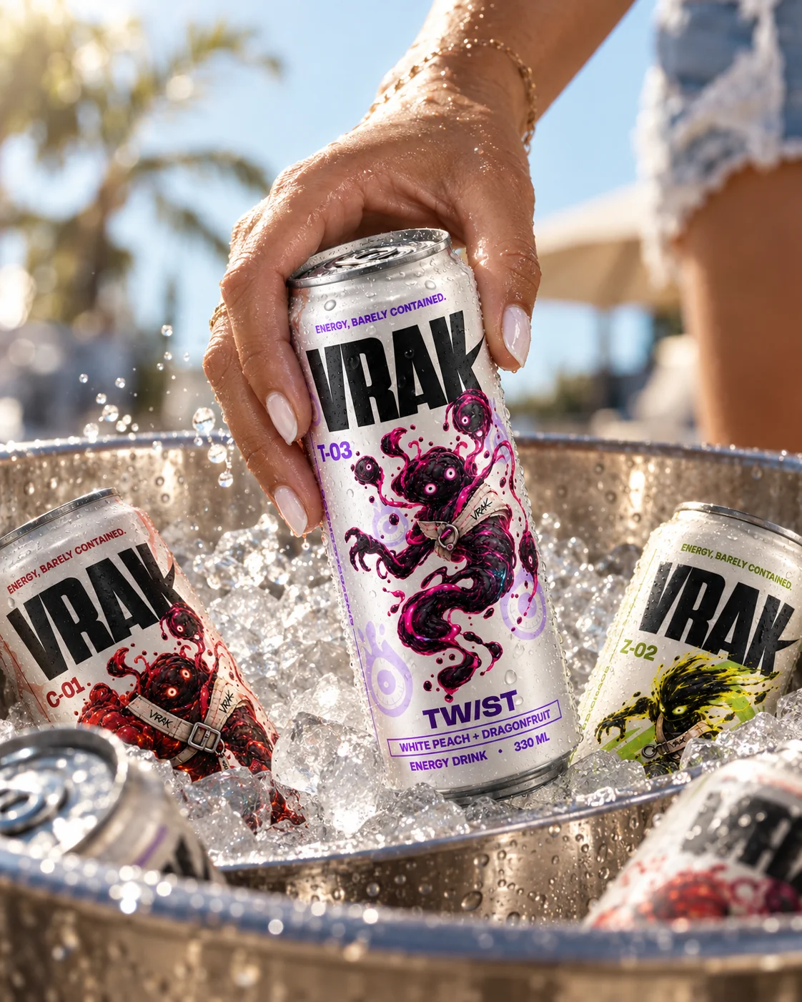
TWIST was built around mutation and unpredictability. I used rotational movement, stretched forms and a violet-cyan palette to make it feel less stable, more experimental and visually distinct from the other two flavors.
I DIDN'T WANT VRAK TO EXIST ONLY AS A PACKAGING EXERCISE.
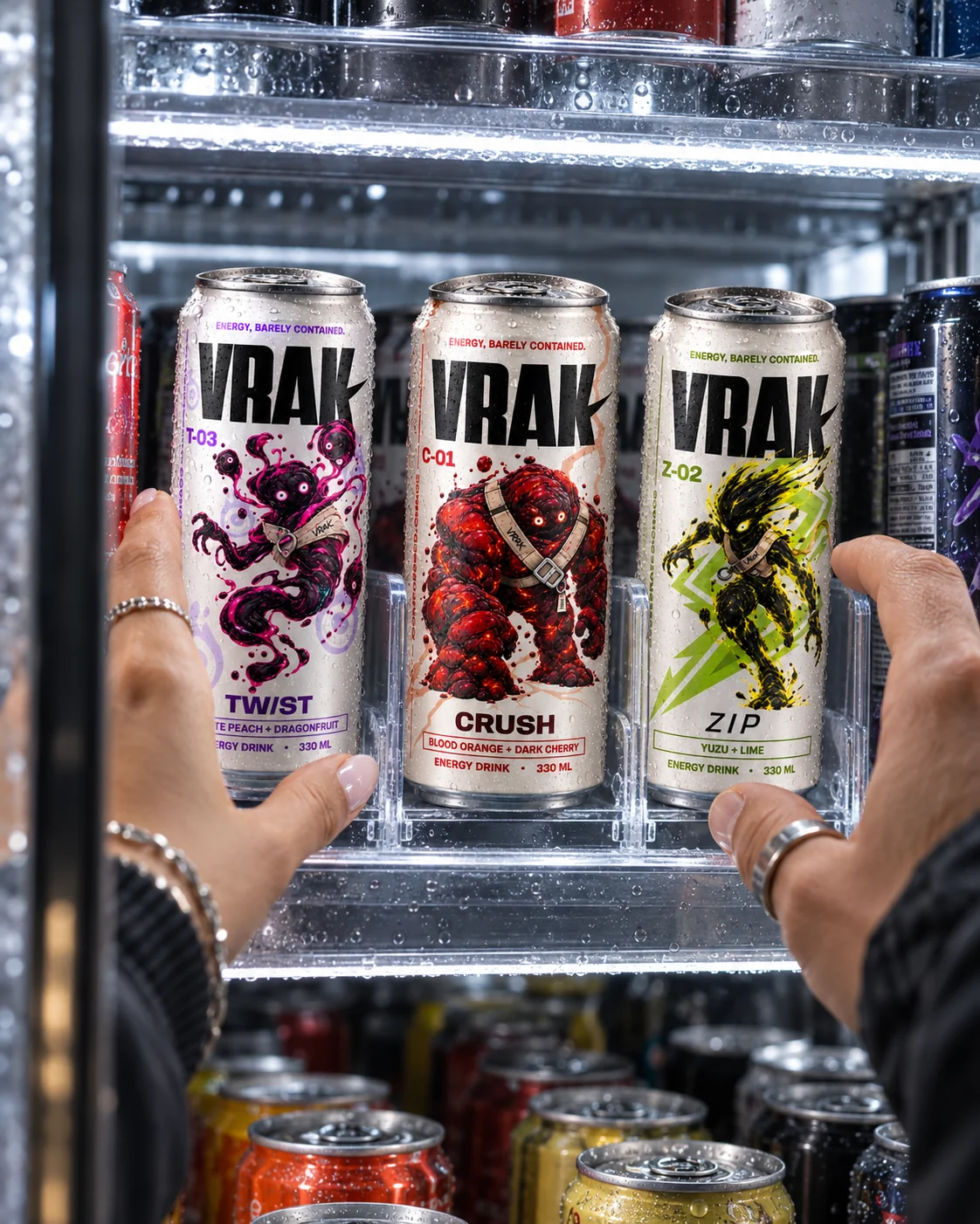
I designed the identity to stay recognizable in real product moments — in someone's hand, in photography and in campaign content. The can remains the hero, while color, character and attitude do the rest.
BRAND IN HAND
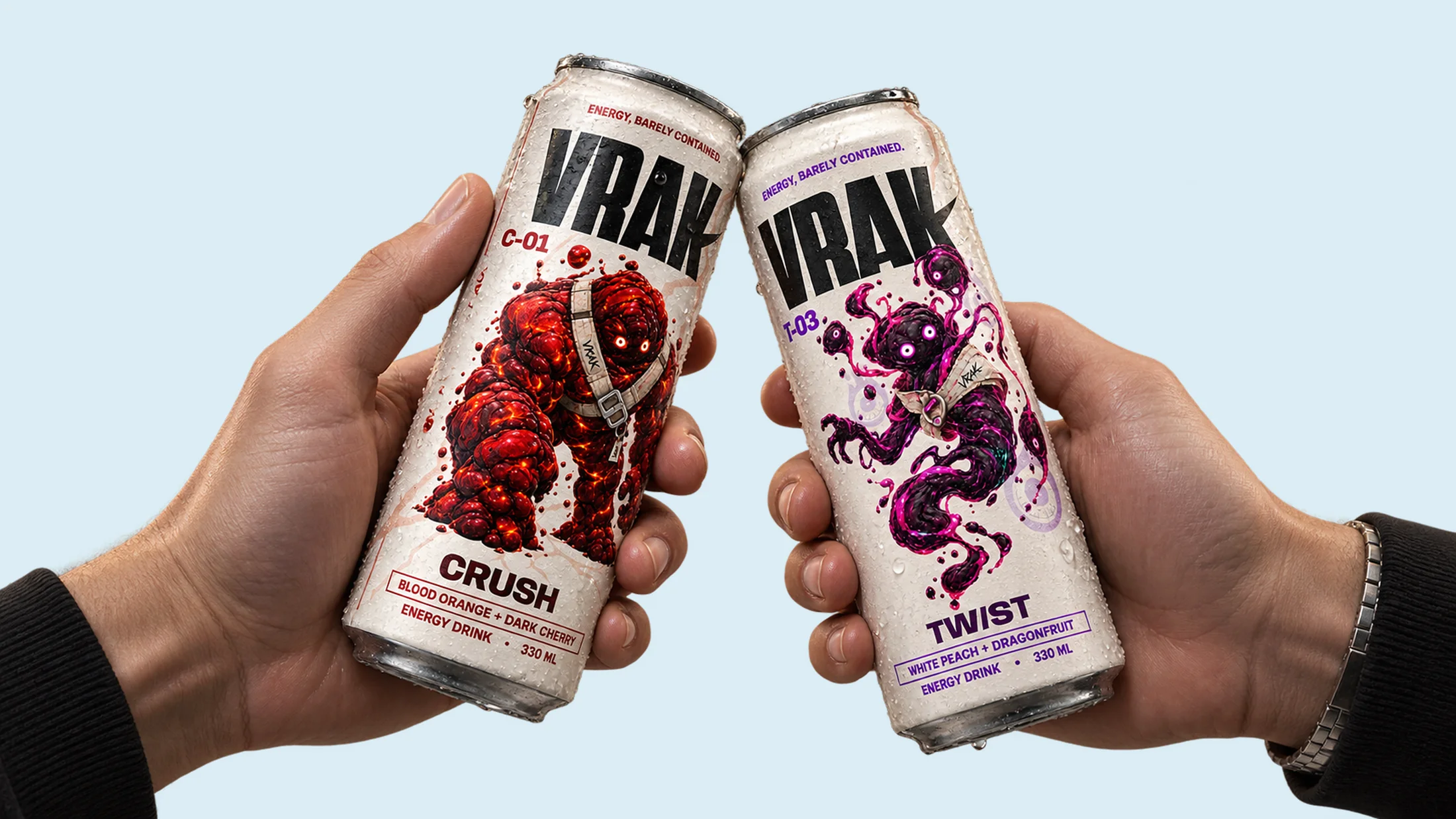
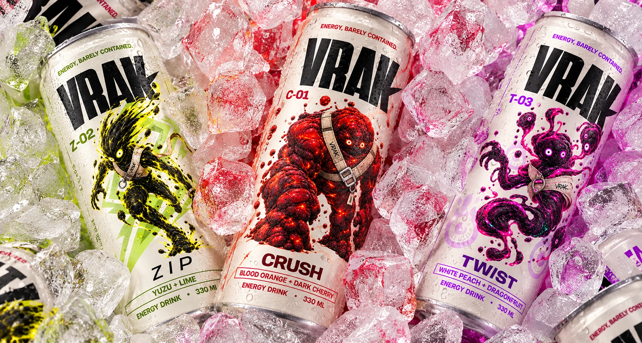
I treated product photography as part of the identity, not just a way to show the cans. Cold surfaces, condensation, ice and strong flavor colors make the product feel physical and immediate, while the composition keeps the branding clear enough to work across launch visuals, social and retail.
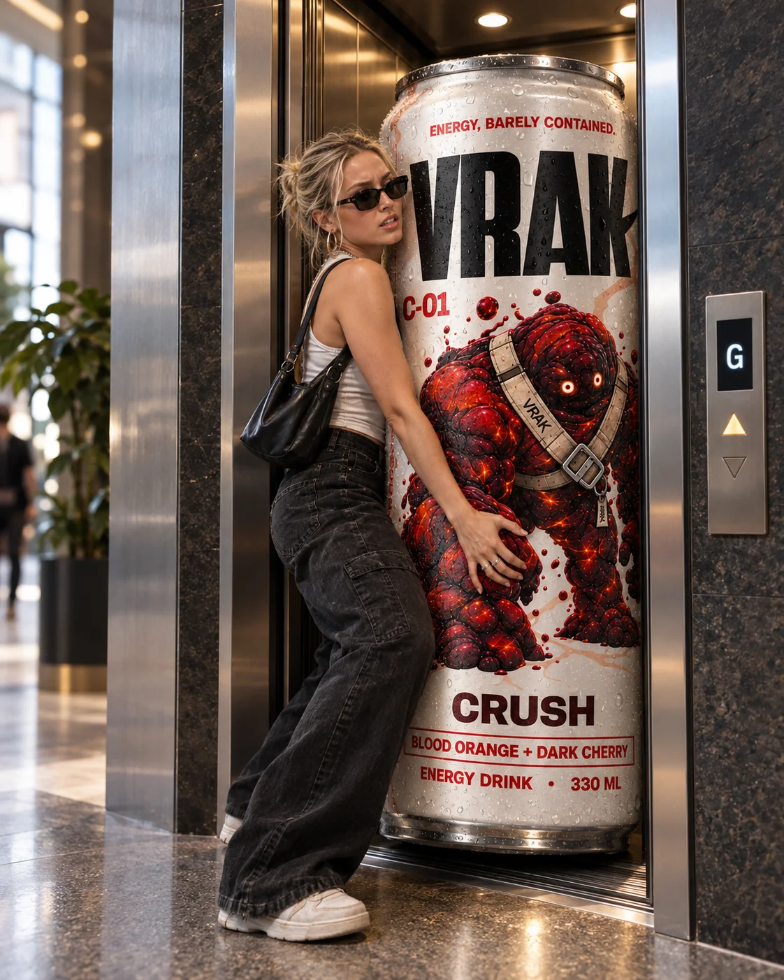
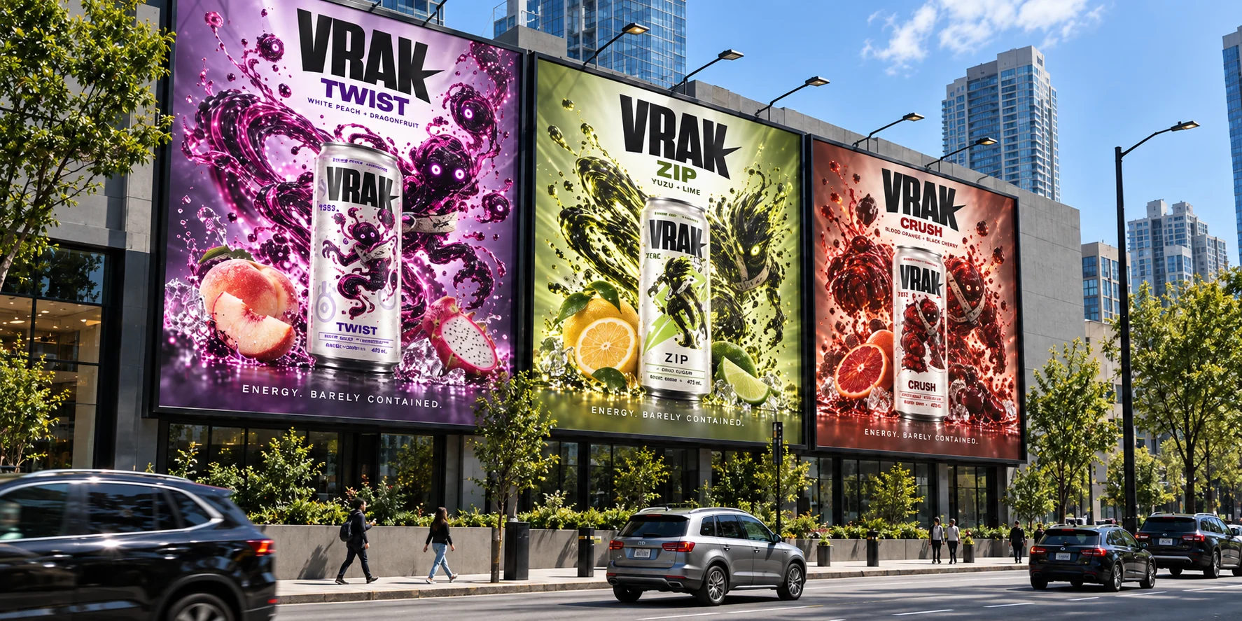
The final test was scale. I adapted the system for outdoor advertising, where the idea has to work in seconds and from a distance. Large product imagery, character-led color and minimal messaging keep each execution instantly readable while making the three flavors feel like one campaign.
THANKS FOR WATCHING